As an Old Data Hand –
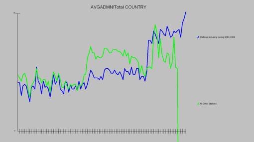
I really got interested in this when I saw the data from New Zealand – showing that the raw and adjusted temperatures were showing different trends:
Specifically the raw data was showing no trend and the adjusted data was showing an upward trend. We ODHs know that if you can’t see it in the raw data, it probably isn’t there. Now that’s not always true and sometimes the data needs to be transformed in an amazingly elegant way and suddenly it fits a new pattern. Then you might get a Nobel Prize, or maybe a word of thanks – but it’s mostly it doesn’t happen.
So I was even more interested in ‘Climategate USA’, the revelation that the number of observation stations used in producing the GISS Land-surface air temperature anomalies (Global Temperature data for the newbies) had fallen from over 6000 to about 1500 during the 1990s and onwards. If there’s one thing we ODHs know, it’s that the easiest way to find what you expect in the data is to select the observations that you include in the result.
(The second easiest way is to find something else to normalise it against!)
There are a lot of caveats and speculation after the exciting graph.
So I did a bit of work with the raw data that was made available through realclimate.org (Climate Science from climate scientists) which is the GHCN v.2 (Global Historical Climate Network: weather station records from around the world, temperature and precipitation) . I had previously checked that I got the same pattern from this data regarding the New Zealand divergence and also the Darwin station fuckup, so I am reasonable sure that I am dealing with the right sort of data.
I certainly get the right sort of numbers against the station count.
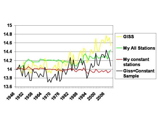
I thought that if the stations observed vary from year to year, it might be interesting to look each year in terms of ONLY stations that reported in that year and the previous year AS WELL (we sometimes call this a constant sample).
Obviously the absolute temperatures can vary very considerable, if a lot of cold stations were included in Years 1 and 2, but dropped in 3, then the Year 2 absolute would be much lower than the Year 3 absolute. However I can’t really see why the change between the two years shouldn’t be a fairly valid statistic.
I can then apply the change to a base year and compare the trend between GISS, and My Constant Station trend. My data is of course unweighted by geography and has no interpolation. So I include my All Station data (also re-aligned to starting point GIFF base temperature).
I can then take the difference between my result for the constant sample stations and my result for all stations and apply that difference to the GISS temperature data (I’ve used absolute difference rather than an index ) to show what the GISS data might have looked like on a constant sample basis. (GISS+Constant sample)

Notes and queries: Am I comparing Apples and Pears? I don’t really know – I’m using the GISS Global Land Station data so I hope not.
The series starts in 1946 as this is a bit of ground zero in the GISS data I’m using with a zero degree anomaly.
Things I haven’t take account of are probably too many to mention. The number of observations in a year from a station are taken into account in the averaging but if one year is January only and the next July only I haven’t bothered. I reckon these things tend to average out.
One interesting thing is how much more variable year to year the GISS data is than my All Station data – that’s the result of me using the data straight and not weighting the stations in any way (for instance by interpolation). I know this is land temperatures only, but logically I expect global temperatures to be pretty consistant year to year – of course possibly with a trend – because it’s the same whole Earth – is that a wrong assumption?
Of course the same analysis is possible for any country with a reasonable number of sample stations – although I haven’t done it
And by the way Jon Sadleir is a cunt.
